Winsley’s Guardian - UI

Project Details
Genre: Action-Adventure Game
Client: Guardian Games
Team Size: 3
Duration: Jun 2023 - Nov 2023
Platforms: Gameboy Color & Analogue Pocket (Mobile)
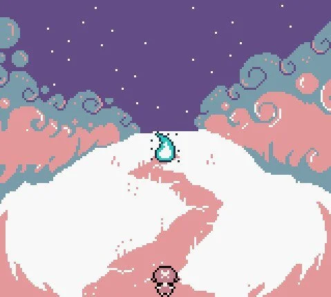
Winsley’s Guardian was a 2D, action/adventure game based on a real world story about the loss of a child.
A story that a father wanted to tell their current daughter about her guardian angel. For the Gameboy Color.
The story would have followed Winsley Spencer as she grows up and learns about her guardian angel, her late older sister, throughout her life. Inspired by Link’s Awakening and Earthbound.
I was originally hired on as a Pixel Artist but eventually became Creative Director and Lead Game Designer.
Problem Statement
Developed on the GameBoy Color, a system that has an intense visual limitation due to the age of the device. Modern gamers have grown accustomed to certain design patterns when it comes to UI, which can be difficult to produce on the GameBoy Color due to these limitations, but we want to be true to the retro aspect of the game, and to the story.
Objective
Create a UI that invokes the nostalgia of original Nintendo GameBoy Color games that also reflects tone and the changes that Winsley and the player experiences throughout the story of the game, without sacrificing modern design .
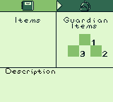
Next, I identified what the game needed. Considering that it is an RPG, we needed a status/inventory menu. It was a small game that was focused more on narrative, so the menus didn’t need to be in-depth.
As for player needs, considering our limitations, there was only so much information we could convey on one screen. While gathering my inspirations, I played Link’s Awakening and several other GameBoy games to better understand what the menus were like back then.
I found in my research that due to the limitations and the added game manual that came with the game, these informational screens lacked necessary information to allow the player to understand what they were seeing. A lot is conveyed through the sprite work and then crammed onto one screen. If you didn’t have the game manual, it was then difficult to understand what to do, what inventory page you were on, or what the item you got was.
Personally, I grew up on Pokemon Gold and liked how they created their information system. As limited as they were, they were still able to convey important information to the player.
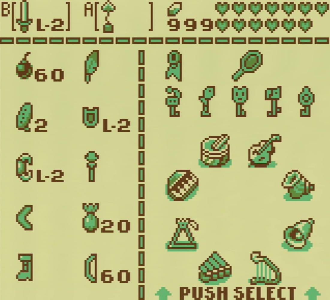
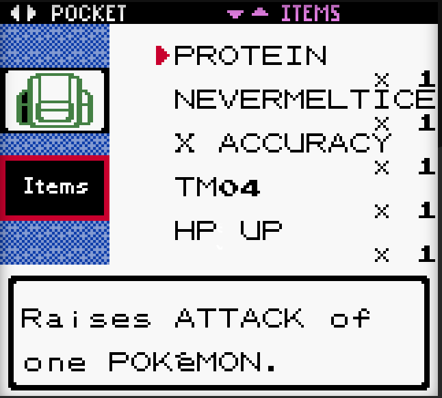
To reach our goal of creating a UI with modern design but that still invoked nostalgia, I chose to combine the two approaches. So that players can still have that retro feeling, but with all necessary information conveyed through the game itself, as there was also to be a digital copy of the game that doesn’t come with a manual.
Step 1: Moodboard and Limitations
As the Creative Director, I started off with creating a moodboard of inspirations to guide the visual design and to help my team understand the limitations we’ll be playing with. The client grew up on playing Zelda games so I chose Link’s Awakening for the Gameboy Color as the base. The game was originally supposed to be on the NES (Nintendo Entertainment System) and the story was one that was very heartfelt and deep, I so I also chose Mother 1/Earthbound Zero as another inspiration.
Then we explored the limitations of the system and engine we were working in. The Gameboy has the limitation of a 3 colors + transparent color, but the assets have to be implemented as specific shades of green, and only 192 unique 8x8 tiles within a 160x144 screen size.
Very limiting, but in my eyes, restrictions breed creativity!
Step 2: Identify Game and Player Needs
Step 3 : Mockup
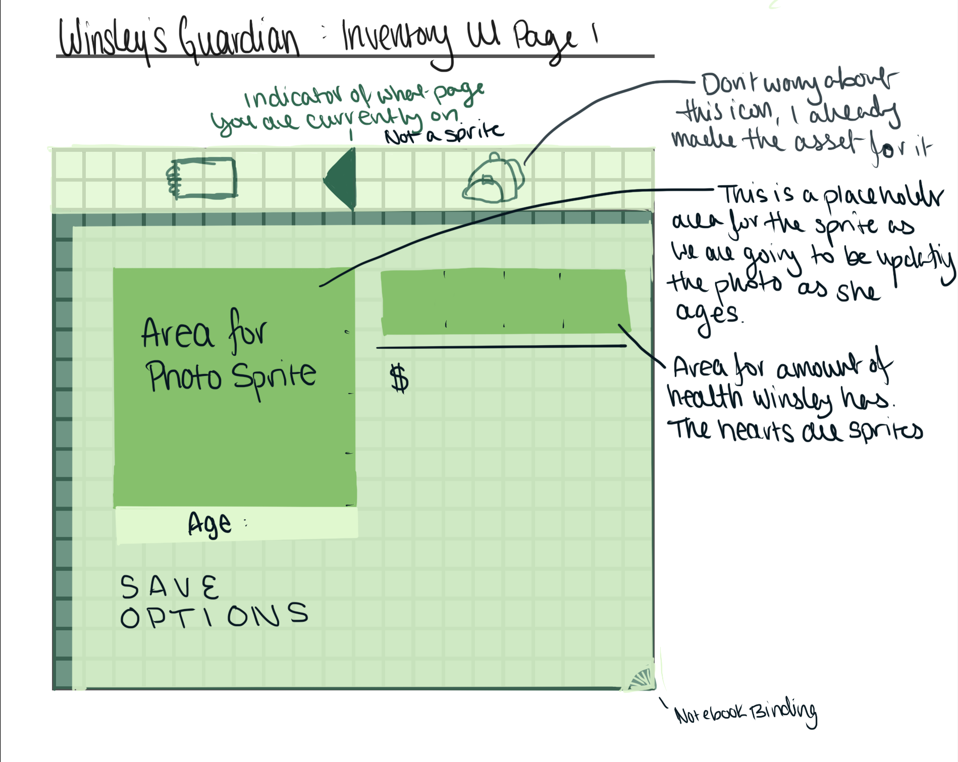
Using my mockup, this is what we created!
I went to work to create an annotated mockup for the artist, using a GBC screen template I created for this project to ensure that it was pixel perfect and ready to implement on creation.
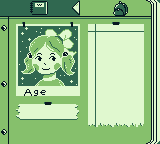
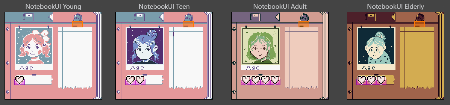
I designed the UI to look like a notebook/diary, as if Winsley (the main character) were keeping a journal of her life as the game took the player from Winsley’s childhood, to her golden years, and eventual death.
Keeping in line with the main goal, I divided the menu into sections and I designed a navigational tool to be visual at the top so the player understands what section of the menu they were in.
On the page itself, all necessary information was detailed with labels so that on first glance, the player understood all components without needing a descriptor.
Step 4: Implementation
Once I placed them in the GB Studio Engine, I assigned their palettes, the interactable/dynamic sprites, and all of the code. I even added a selection cursor.
Check out the video!
Retrospective
I think I did very well on this design, given everything. I met the goals I set out for the UI/UX for this project and learned a lot in the process, not just about UI and information, but quite a bit about retro game design.
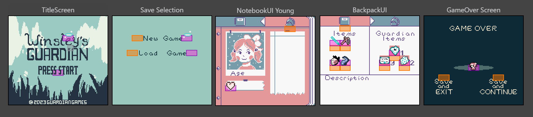
I do think if I had continued on this project, things could’ve iterated to be even better, like the “Game Over” and the “Save Selection” screen, but as it stands, I enjoyed what I made and it works beautifully for what it was made for.
Want to see the whole “Winsley’s Guardian” demo that I was hired on as a Creative Director and Lead Game Designer?